Marc Lee

A Product Portfolio

Welcome. I'm Marc and I like to create things.
Product R&D - an Intro

Product, particularly software, is an unbelievable method for rapid innovation, experimentation and prototyping - the perfect medium for Entrepreneurs.

A common theme I noted when deciding to pull together a Product portfolio was how many projects I had been a part of that were highly innovative - creating and launching new things, and solving problems outside a normal team's scope is where I have excelled.

My focus now is continuing that entrepreneurial pursuit of discovering new things that solve exciting problems in delightful ways through a mix of Product and UX techniques - I call this Product R&D.

Case Study 09  

Team Aretas Expansion

A Platform for CrossFit Athletes to Enter Competitions

Client: Team Aretas

Project Name: TA Competitors Functionality

Brief Summary

Athletes need a way to input their scores and upload a supporting video of a workout to the online, web based, competition management software.

The Team Aretas competition software currently allows for performance scores to be entered by the competition organiser during the event. To continue with our development roadmap and objective of producing functionality that can be re-used for the mobile app, we need to develop the user experience for the athlete to be able to enter their score themselves.

Deliverables

  • Research insight & findings concerning competitors, user types and behaviour
  • Personas and scenarios
  • Experience map/User journeys
  • Information Architecture
  • Design & usability recommendations for improvement
  • User flows and Screen flows
  • Product Sketches and wireframes
  • High fidelity mock-up
  • Prototype of design(s)
  • A final presentation to the client which summarises the UX work

Intro

Team Aretas are a sports data company. They are interested in making people fitter through social connections, and are currently working on a competition management software which allows the organiser to run entire fitness competitions. As part of this scores need to be collected.

They wanted to expand their market share, reach, usage and ultimately data by offering a solution for CrossFit Athletes to enter a CrossFit competition through their platform by uploading their own scores.

Athletes needed a way to input their scores and upload a supporting video of a work out to the online, web based, competition management software.

As part of the brief, Team Aretas wanted me to focus on a workflow covering:

  • How to notify athlete to complete workout including a mock up of the communication (eg email).
  • How the athlete enters their score and supporting video.
  • How the competition organiser approves/ amends/ rejects the athlete’s submission.
  • How the athlete is notified of the approval/ amendment/ rejection including a mock up of the communication (eg email).

The athlete notification needed to include the workout description, the scoring method, submission date and time and explain the need for a supporting video.

Once the competition organiser approved the athlete’s submission, the score would be fed into the pre-existing leader board where it is ranked.

Approval meant that the competition organiser accepts the number of reps / time taken that the athlete has entered and has verified with their video.

Amend means that the competition organiser has decided to modify the athlete’s score in line with the video. The details of any amendments and the reason for the amendment must be communicated to the athlete.

Reject means that the competition organiser has decided to reject the athlete’s score entirely. The reason for the rejection must be communicated to the athlete.

All of these processes needed full researching, and then screens designed. As there was a focus on a future app, and users were most likely to use a mobile device with the product, it was decided early on to take a mobile first approach with any solution.

Project Goals

  • Notify athlete of new competition / workout.
  • Enable athlete to enter score & upload video.
  • Enable competition organiser approve / amend / reject athletes submission.
  • Notify athlete of approval / amendment / rejection of submission.
  • Provide functionality that can be reused in App.

Problem

There were three core stakeholders that had to be considered during this project, and they all had differing problems that needed an over arching solution.

Team Aretas needed a way to collect more data and encourage further usage of its platform in order to meet its long term business goals.

The main existing user of the platform, the competition judges, found it onerous to log and upload all competition data in advance and during any competition.

CrossFit athletes who wanted to compete had to find an existing competition and judge to enter through, rather than direct - this discouraged them from entering competitions.

Research

As the brief was particularly unique, and time was limited, the first requirement was a research strategy and understanding what tools could be utilised to conduct a thorough amount of research in a short space of time.

Contextual Analysis
A logical place to start is to understand the user in the environment that the product is used, or associated with. In this instance, I visited a CrossFit Gym, or ‘Box’ as it is referred to by CrossFitters.

This environment helped to empathise with the potential users - understanding what it is they do, how they go about it, and how a product can fit in with that routine and lifestyle.

Spending time in the box instantly threw up some concerns around how an athlete could record an entry for submission - mainly around the physical act of recording themselves doing the routine, and small logistical issues like lack of mobile coverage or wifi.

Fortunately CrossFit boxes have trainers on hand to help, and usually you partner up - so the act of recording a submission was possible - however, uploading or live streaming a video upload directly through the product was deemed too challenging by the client, and this functionality was de-scoped.

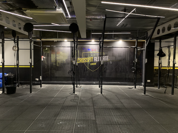
Aldgate CrossFit Box

Competitor Analysis
Having that empathy with the user, and understanding the business goals provided a helpful springboard to look at the competition. Namely, were there any solutions that currently existed similar to the current product and future product vision.

After reviewing a number of competitors, it was established that the current closest competitors were Reebok CrossFit and Competitor Corner.

However, both of these products still did not offer a great experience, with only competitions the sites themselves organised being listed and communicated - even then, there was a disjointed process of applying for a competition with potentially 2 or more different sites requiring navigation to find and enter the competition.

Focusing on the business goals and potential functionality when looking at potential competitors threw up more examples with companies such as Strava, VPAR and WODProof all offering something similar.

These applications all provide the ability to capture data, record scores and track performance, and the community aspect is a big factor in their functionality - all points that need to be considered for this project and a future native application.

The User
With a good understanding of the product’s aim, the user needs and the competition it was time to dive a bit deeper and extract insights that would ultimately help drive the solution at ideation phase.

I created a screener survey that could be distributed by the client through their own and partner’s channels - in this instance Facebook groups that had been created by the individual CrossFit Box. This provided a good spread of coverage geographically, as well as demographically and also athletes - from those that have never competed in a CrossFit competition, to those that compete regularly.

The surveys response rate provided some interesting insight straight away; 42% of responders had competed in a competition before, with 44% having used a CrossFit app, and 37% having recorded themselves doing a workout.

I then applied criteria to those responders to whittle down who would be best to interview. This criteria focused on those that had competed in a previous competition and had also used a CrossFit app previously.

Using open ended questions related to CrossFit competitions, I tried to extract as much insight as possible in order to help provide direction for any solution. The interviews threw up some notable quotes that helped focus the mind further into the process during the design studio.


“I want to be told of a new competition & be able to find the info quickly & easily”

“If I could record & post videos within the app that would great”

“You don’t even know they’ve looked at your entry”

“I don’t even know if the video has been uploaded”

Affinity Mapping
After about 15 face-to-face and phone interviews, there was enough feedback to begin pulling out insights to analyse.

Grouping these insights using the affinity mapping framework resulted in two common themes; one was around competition notifications, specifically when there is a new competition and being notified of the progress of their competition entry.

The other was around the process of submitting their competition entry and video, and what was expected.

Using the Jobs-to-be-done (JTBD) framework. I could then take some of these insights and plot them to a particular statement along with related ‘jobs’ - framing it this way helps with the ideation process when defining a solution.

I then used the How Might We (HMW) framework as a further way of dividing the problem in order to design solutions.

Main Job
When I am entering an open CrossFit competition, I want to submit my video and score as efficiently as possible so I can hopefully be accepted on to the competition.

How might we aid the user to submit their video and score as efficiently as possible?

Related Job
When I am making the time and effort of entering a CrossFit competition, I want to understand the progress of my application so I can follow my submission status.

How might we keep the athlete informed of the progress of their application?

Solution

With the research throwing out some insights, and allowing me to justify and pinpoint the problem to be solved, I worked with the client to design solutions through a sprint session called a Design Studio. This allowed for rapid prototyping and ideation of screens and features that tied in with the HMW and JTBD statements, and ultimately took us down a path to an overall solution.

The crux of the solution was how a user flow could be designed to make it as simple as possible for athletes to enter a competition, and be notified of the process. By making this process as simple as possible, research indicated more athletes would use the product.

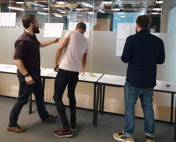
Team Aretas Mid-Ideation

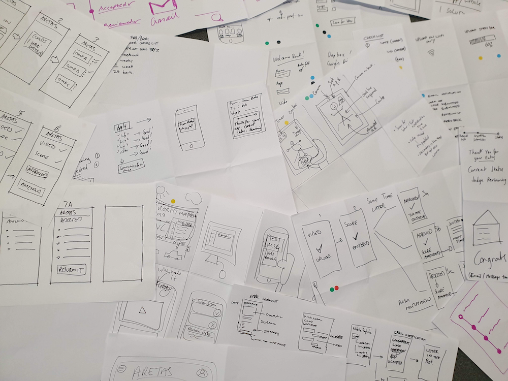
Paper Sketches of Solutions

Design Iterations

Once I had a rough set of prototype screens, with a defined user flow, it was time to test with users to ensure there wasn’t anything that hadn’t been overlooked, and that the process was clear and straightforward.

The below iterations show some of the usability issues thrown up during testing, and progressing from an initial paper prototype, through to a mid-fi screen to the final hi-fidelity design.

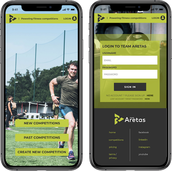
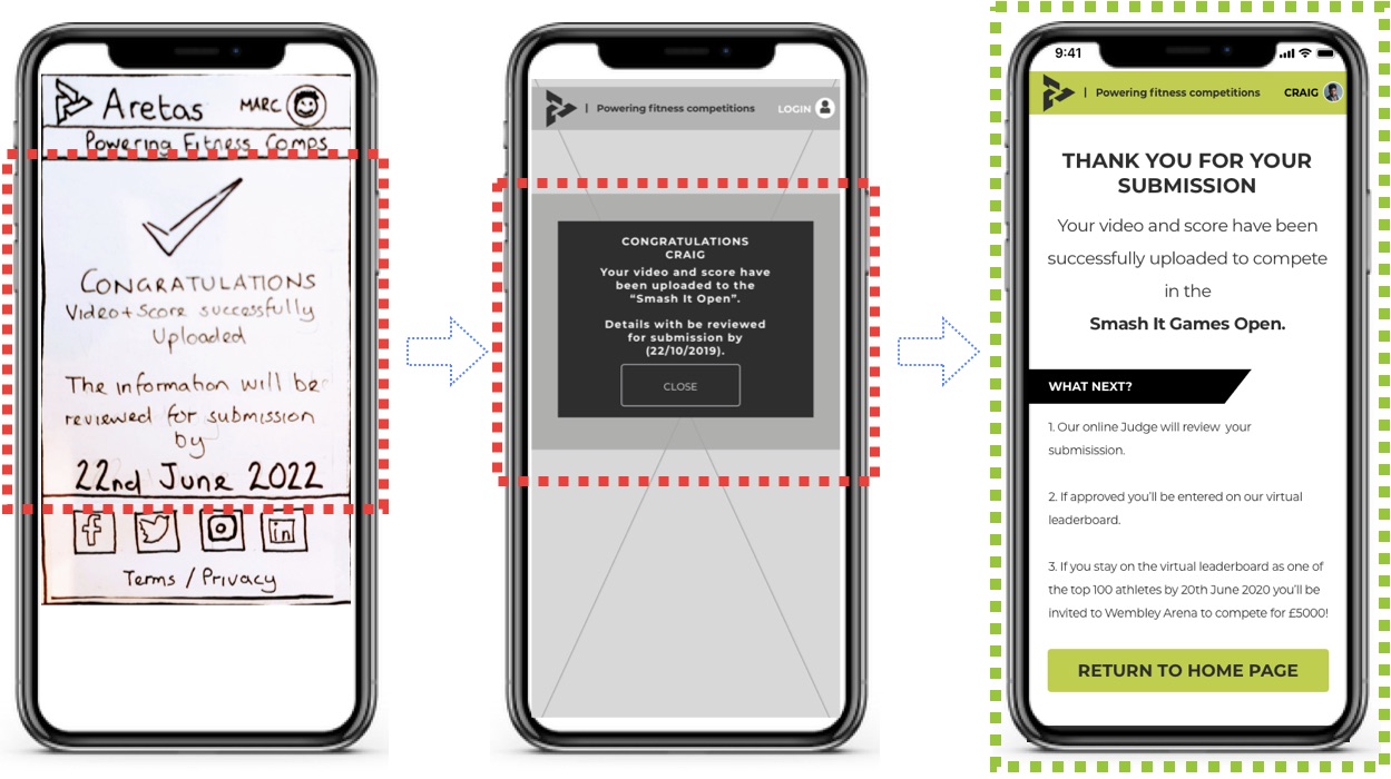
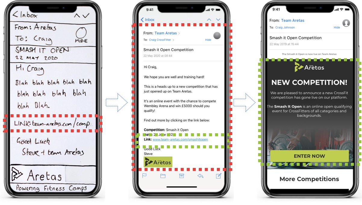
Scenario 1 - Competition Notification

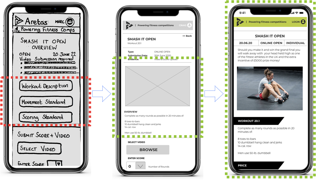
Scenario 2 - Competition Page

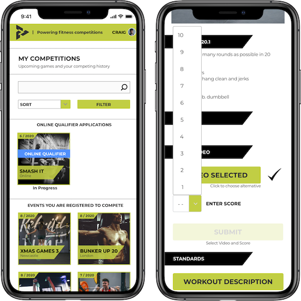
Scenario 2 - Competition Entry

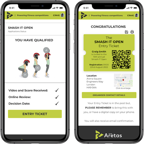
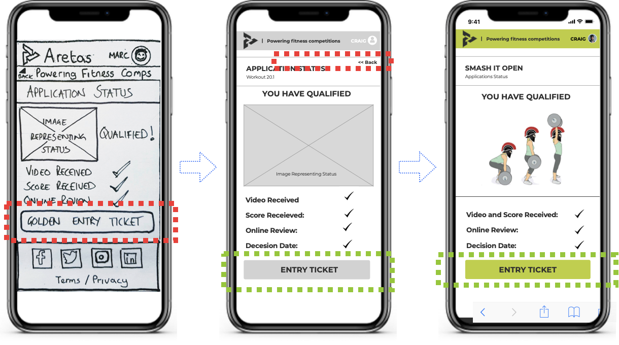
Scenario 3 - Competition Submission Progress

Demonstration

In the below video demo we have Craig, a CrossFit athlete. The 4 scenarios that are run through are;

  1. Finds out about competition.
  2. Enters competition with a video and score submission.
  3. Logs in to check out the status of his application.
  4. Receives an email showing his application was successful.

User Flow Video Demo


Final Hi-Fidelity Designs

You can explore the hi-fidelity designs, along with the functionality with the clickable demo found here.

These designs would be delivered to the development team who could then turn them in to code.

Conclusion

Team Aretas’ roadmap was to ultimately consume as much data as possible that could be used for a number of different business models. The best way of achieving this was to allow athletes to submit data themselves - and as the usage volumes grow, so does the data.

This was the first step towards that business goal, and the initial product goals were fulfilled in this project;

  • Notify athlete of new competition / workout.
  • Enable athlete to enter score & upload video.
  • Enable competition organiser approve / amend / reject athletes submission.
  • Notify athlete of approval / amendment / rejection of submission.
  • Provide functionality that can be reused in App.

In regards to next steps, the two key areas to develop would be the Judge / competition organiser functionality, perform CrossFit environment testing, and ultimately build a native smartphone application - the video below provides a proof of concept for this app.

Proof of Concept App


> Continue Reading

Case Study 08  

Launching Native Advertising at Haymarket

A Cutting Edge Advertising Format for Digital Publishing

Client: Haymarket

Project Name: B2B Native Advertising

Brief Summary

The commercial push in to digital has resulted in a fragmented and disjointed commercial offering across the various products - ultimately limiting potential revenue and hurting the user experience.

Create a new solution that enables Haymarket to take advantage of the opportunities of newer advertising technologies and therefore create a more holistic approach to its advertising options that benefit both the advertiser and the user.

Deliverables

  • Native Advert Designs
  • Full JavaScript code testing
  • Full Integration with DoubleClick
  • Train Ad Operations
  • Create Sales pack
  • Train Sales team
  • Join early Sales client meetings

Intro

The struggle to move away from a heavy reliance on print towards digital is an ongoing problem at Haymarket. Both editorial and commercial teams are still largely focused on print, and the opportunity of digital is being missed with newly formed digital competitors eating in to market share.

I was brought into Haymarket as an evangelist for digital - to show the opportunities of digital for the business as a whole, to implement new solutions that offered exponential growth and to also bring everyone else along for the journey.

Haymarket have the building blocks to becoming a fully digitally focused publisher, with a number of departments focused on the digital operations - however, there wasn’t a unifying solution that could focus the minds of all departments to thinking digital first.

As a Product Manager with a heavy focus on the commercial side of the business, I spotted an opportunity to move Haymarket deeper in to the digital mindset, whilst unifying editorial, commercial and ad operations.

The ultimate aim was to improve the user experience, improve the value of digital advertising for the clients and increase revenues.

Problem

In an attempt to sell more advertising in print magazines, the sales team were ‘bundling’ a lot of digital ad slots with the deal. This caused numerous problems, it undervalued the advertising real estate, it caused a lot of repeat advertising and sometimes it resulted in garish ad formats that affected the overall user experience.

Some of the more intrusive ad campaigns caused a large amount of issues within editorial, who felt they were detracting far too much from the content, whilst the sales team obviously had to generate revenue.

Ultimately, it fell to me to arbitrate between the sides and weigh up if the revenue justified the poor user experience. This obviously wasn’t a long term solution, but it presented an opportunity to create something much much better to the benefit of all.

Research

Due to the impact of any solution on a number of different departments, as well as external parties (clients and readers), it was important to fully understand the problem and therefore the opportunities.

I spent considerable time working with these different departments to understand what was possible - after all, any solution had to solve problems for all parties, otherwise other problems could arise.

The core departments were;

Editorial needed to be fully onboard with any solution that they felt would impact on readers or content, and also potentially be utilised to push internal content.

Sales needed to be confident that any solution could be sold, and was something their clients and the marketplace were looking for.

Ad Operations had a previous stack in place, and in order for them to be fully involved any solution needed to fit in to this stack and their workflow.

Existing Solutions

When I was observing the existing advertising options, I noticed a lot of potential for an overarching solution for a new ad format that could help solve the problem.

There was already a significant digital ad operations team in place that utilised Google’s DoubleClick for Publishers (DfP) - they were largely under utilised, running standard unsophisticated client campaigns and house ads - DfP was also under utilised, and such an expensive ad server was struggling to justify itself.

Aside from standard banner advertising, Haymarket had for a number of years been offering ‘commercial solutions’ to advertisers - these took the form of advertorials - sponsored features that had a general theme for each campaign.

Some of these were highly popular amongst their followers, and had some great content - they worked particularly well in the B2B advertising space and were highly lucrative.

However, they didn’t receive much traffic due to a lack of general promotion, making them hard to find. The majority of the value for the advertiser was having an advertorial featured in the print magazine. There was a single promotional slot that could be found in the sidebar on some of the sites, and this served as the sole means of generating traffic to the sponsored content.

Solution

Haymarket had the technology (DfP), it had the teams (Ad Ops, Sales, Commercial Solutions) it had the clients, and even had a ‘beach head’ - an offering to the market that was already in place and enjoyed (sponsored content).

At the time, the editorial of Haymarket’s MarComms department were one of those pushing for an improvement in our digital advertising solutions because they were regularly writing about new innovations in the industry through Brand Republic, Campaign and Market Magazine.

This scenario couldn’t have been better to help me find the solution - Haymarket had the very people who were writing and observing emerging technologies in the advertising industry in the same building. This resource proved invaluable in helping find the solution, and also had the added benefit of being endorsed by the very team who were pushing for a new solution.

I devised a ‘Native Advertising’ solution that matched the look and feel of the existing site, opening up new advertising slots, new traffic, and new opportunities - improving the performance of a digital advertising campaign, improving the user experience and improving the perceived value of B2B digital advertising through Haymarket.

Using a third party technology (polar.me) allowed Haymarket to utilise DfP in order to serve the adverts. The adtech solution also allowed for easy creation of new advertising slots that could be targeted to individual elements on a page and managed via DfP.

It also means that HBi - Haymarket’s development team - had a light touch and were only needed to implement the required Javascript and test that it didn’t impact on anything or cause bugs.

From there the Ad Ops team can manage the native advert campaign like any other. Including all of the more sophisticated options DfP allows for, like targeting by location, or user type, or other options.

Building on the success and potential of the Content Solutions team provided a great starting point for utilising the Native Advertising solution - pushing more traffic to the sponsored content, allowing for optimisation and improvement as well as providing numerous stats and examples to the sales team.

From here, the solution could be used to push traffic to a number of other areas of the site, or even direct to an advertiser. This was all incremental as well, and didn’t replace any existing ad placements.

Headline Numbers

  • First 12 Months: 1,681,018 Impressions / 3,886 clicks / 0.231% CTR
  • 24 Months: 5,482,198 impressions / 11,195 clicks / 0.204% CTR
  • 36 Months: 32,949,059 impressions / 36,993 clicks / 0.112% CTR / 01 min 10 sec Av. Time Spent

Conclusion

The challenges that traditional print publishers are facing are not going away anytime soon - and whilst the decline of print as a format has levelled off, it has still left a large hole in revenue.

Whilst the transition from print to digital is difficult, new revenue opportunities that are surfaced by digital show that it is possible.

The native advert stats above show this potential in its raw form - these numbers are all incremental, and whilst the impressions may be bundled as part of a deal, or sold on a CPM, the value is clear to see for both client, reader and Haymarket.

The solution itself was ideal - it didn't require a vast amount of resource to implement, which meant it was quick to launch and relatively cost effective. I was particularly pleased with the positive feedback from across the business, and that it is still being heavily utilised a number of years after launching.

> Continue Reading

Case Study 07  

Microsoft Advertising Research Trends Microsite

Microsoft’s Extensive Insights Given a Home on Brand Republic

Client: Microsoft / Haymarket

Project Name: Microsoft Microsite - Brand Republic

Brief Summary

Microsoft Advertising has produced a mountain of in-depth research around ‘Digital Trends’. This research is incredibly insightful, particularly for branding campaigns for advertisers.

Microsoft want to share this research to the industry, getting more exposure to it and in turn position themselves as a major player in the digital advertising space. Brand Republic have been earmarked as a media partner that can help with this goal.

In the first campaign of this partnership, Microsoft needs a home to share the research to the Brand Republic audience.

Deliverables

As the project was quite wide in scope, and something that was initiated from an external partner, it was more of a project/product manager hybrid function.

My role was to not only launch the digital product, but also co-ordinate with a number of different departments in order to make the campaign happen all within budget and in a very limited timeframe.

Intro

With a diverse ecosystem of products and services that touch millions of peoples’ lives around the world every day, Microsoft tries to understand the changing landscape of consumers’ wants and needs in order to shape their business.

Research is essential to their goals and as part of their advertising business they believe the information and insights they gather can be invaluable for other brands.

Microsoft were already discussing a few different opportunities with Brand Republic when the opportunity came up to utilise a particular Microsoft research project called Digital Trends.

Microsoft wanted to partner with Brand Republic to share these insights with their audience, with the aim that readers find useful information that may help them shape their next brand campaign and help deliver what their customers want.

The main challenge was the short time frame for this particular campaign, I therefore became involved in order to deliver it.

Problem

In this instance the problem that was trying to be solved wasn’t necessarily audience lead, but revenue and client lead.

Microsoft Advertising had an ambition to work closely with Brand Republic and Haymarket on a number of future projects, but they needed this particular campaign delivered before those campaigns could be discussed.

The campaign in itself had great value to the audience, and Microsoft saw an opportunity to even help solve their problems through their own research and technology.

From Brand Republic and Haymarket’s perspective, it was a great opportunity to show they had moved in to the digital space and were able to deliver campaigns in a timely manner.

I had two weeks from agreeing a general plan to delivering it.

Research

Because of the time limited nature, I had to understand what we were capable of doing. If we were too ambitious, there would be a time overrun - if however, we weren’t ambitious enough, it might affect future campaigns.

First of all was fully understanding Microsoft’s goals and how they could fit in with any potential solution. Working closely with the Haymarket Account Manager, and Microsoft themselves, the main areas that would shape the solution was the volume of the Digital Trends research that was to be shared, and that analytical data was highly valuable to Microsoft.

With the above in mind I took the time to discuss the best methods of sharing this kind of text and image heavy information with the existing team. They had previously worked on a number of content solutions and sponsored campaigns of a similar nature. This instantly through up some solutions and options, however it didn’t quite satisfy the client’s needs and ambition.

Further discussion with HBi (Haymarket’s software development department) opened up more possibilities for potential solutions.

Solution

Once the clients need’s and Haymarket’s capabilities were understood, we gathered in a meeting to discuss solutions that could meet the goals in the required timeframe.

My vision had been a dedicated ‘microsite’ as it allowed flexibility with the vast amount of content, and we were able to drive traffic from Brand Republic directly to it - this traffic would come from specific sponsored articles, promotional slots and also the daily newsletters.

Microsoft Advertising agreed, and they also agreed that the only way to deliver the campaign was for myself and a developer to conduct a 4 day sprint in the Microsoft offices with their team as a way of expediting focus and alleviating any issues in a fast and efficient manner.

The microsite was given a unique URL that helped reinforce the partnership; http://microsoft.brandrepublic.com - It was a responsive site, and could easily be expanded with more information for future Microsoft campaigns.

Headline Numbers

  • First 7 days, Unique Visitors: 1,521
  • Page Views: 2,415
  • Avg. Visit Duration: 1min 10 seconds
  • Return Visits: 24.8%

Conclusion

Any project of this nature is fun, but with one of the biggest companies in the world as the client, a tight timeframe and a lot of pressure, it ramped up the adrenaline and I was very proud of what was achieved considering the time frame, budget and resource.

As far as the brief was concerned - the figures from the first week show that we went a long way to achieving the exposure Microsoft was looking for, and that helped solidify the partnership and future deals.

The product creation process itself was probably the best part of the project - knowing the small amount of resource and time, being able to create something from scratch working hand-in-hand with Microsoft in their offices was a valuable experience and a satisfactory problem solving exercise.

Press

Having The Digital Time Of Our Lives - i.co.uk
> Continue Reading

Case Study 06  

Campaign Magazine Live Event Coverage

Enabling Journalists to keep Readers Updated in Realtime

Client: Campaign Magazine / Haymarket

Project Name: Live Blog

Brief Summary

A solution is required that can be used by Campaign Magazine journalists to keep readers updated in realtime on industry events. This will benefit both readership and the business through increased traffic and a higher average time spent on the site, along with a large increase in commercial potential.

Deliverables

Once the problem had been established and a general plan set, some research was required in to how other publishers had tackled a similar problem, what readers expected with such a solution and the context of when readers would be following the live content.

There was also a requirement that any solution was cross brand, i.e. could be utilised by other publications with a new ‘skin’ that matched the design of the publication.

Finally, rather than just a general product, any solution created would ideally be event specific with its own unique URL.

Intro

The Campaign Magazine journalists spend a lot of time covering industry events, where big announcements usually take place. Unfortunately the nature of publishing means that updating the audience quickly is difficult, as an article takes time to write and edit before being published.

This meant a lot of journalists were using platforms like Twitter to update their audience, depriving Campaign Magazine of valuable traffic.

Additionally, 3rd party platforms had their own limitations for the journalists, and readers of the site were also being deprived of updates.

Problem

When there are live events a lot of information, news and insights are delivered in a very short space of time - particularly during a keynote presentation.

For a traditional print publisher, it’s a far departure to consider updating your audience in real time, and slowly this meant that both the audience and the journalists migrated to other third party platforms where they could find out news as and when it happened.

However, from a reader perspective, having to hunt for information on a platform like Twitter can also be tricky, and a single trusted source that can keep the reader up to date didn’t exist.

Research

Journalists
One of the main stakeholders were the journalists themselves, and we needed to understand what kind of solution they would be looking for and how they would use it. It was important that they were heavily involved in the project as they would be using it the most.

Competitors
Many other publications faced the same kinds of issues and had attempted to address the same problem in their own way. No direct competitors had built anything, but there were plenty of non-direct competitors that had attempted to tackle the problem.

Structuring the competitor analysis lifted out some design ideas, but also content ideas, i.e. how updates should be structured (long and detailed, or short and snappy).

Readers
Fortunately, Campaign Magazine had a loyal following of readers that were often keen to engage at any opportunity. This meant that speaking to a number of readers quickly to validate the problem and understand how they would normally consume updates was relatively straight forward. We validated the problem, and also gained insight in to the type of solution that we could design.

Solution

Taking in to account the brief and key requirements, the end vision was a responsive product built on Wordpress that could automatically load updates.

This product was able to be re-skinned easily for other publications, as well as allowing for multiple installs with unique URLs for each event.

From a journalist perspective, it was simple to provide quick updates with text, images and videos, and there was the ability to allow access for multiple journalists to update simultaneously.

I found during research that readers would use the site both when sitting at their desk in an office and on their phone whilst at the event - this meant we also implemented a responsive design that could change depending on the viewport of the reader.

Conclusion

Covering a large industry event always brings a number of pressures, particularly when the perfect coverage is so important and there is little opportunity to get it right. So bringing together a number of different stakeholders to make this product work added an extra challenge.

However, by bringing along those stakeholders, they were invested in the product and wanted to make it a success as much as possible. Ultimately it worked exactly as planned and by taking some of the ‘technical’ leg work off the journalists, it relieved the pressure and allowed them to focus on what they are good at.

Press

Campaign launches Live@Cannes blog - Campaign Magazine
> Continue Reading

Case Study 05  

O2 More Relaunch

Expanding Revenue Streams whilst adding value to Existing Customers

Client: O2 Media / Telefónica

Project Name: O2more.co.uk

Brief Summary

Relaunch O2more.co.uk as a loyalty platform that contains offers for O2 Customers that are monetised, generating revenue for O2 and also driving users to the core O2 More mobile advertising network.

Deliverables

The project required considerable research in to what users were looking for, and what companies O2 could partner with for the consumer offers.

My core deliverable was a newly launched site, along with a back end element that allowed for partner companies to upload offers through.

Finally there was a weekly newsletter that was launched to push the offers to those O2 customers that had signed up.

Intro

O2 Telefónica like a lot of telco’s were observing the increased threat from tech companies as well as decreasing average earnings per customer and launched O2 Media as a way of generating new revenue streams from customers and the vast quantities of data O2 had.

One of their first product offerings was O2 More - a SMS advertising service that would target opted in customers with relevant advertising.

I joined O2 Media from a previous role and also having experience with SMS advertising from my first business/product (eyetxt/Stuwd). I was tasked with relaunching the O2 More platform to show and provide more value to those O2 Customers who had signed up.

The Problem

The core problem we were trying to solve was a bit more complicated than usual. This was because there was a 3rd stakeholder in the mix in the form of partner companies who would be providing the offers. This resulted in a difficult problem that needed a solution that would satisfy everyone.

The Business
How can O2 Media leverage their data, size and relationships to build a platform that can benefit their users and generate revenue?

The User
O2 Customers have signed up because they are interested in receiving relevant targeted offers from major brands that have partner with O2, how can we bring more of those offers to them and help them.

The Partnerships
The most crucial piece of this puzzle. Without partner companies and their major brands, along with great consumer offers, the product would provide no value to O2 Media or its users.

Research

Because the most crucial stakeholder was identified as the partner companies, I spent a lot of time solely meeting and discussing options with a huge amount of companies.

This took shape in the form of offers they could provide, and the partnership we could have - including business model.

With the rise of Groupon and similar offerings, there was a lot of interest from the market and we were able to not only strike a lot of good partnerships prior to launch, but also to take feedback from those companies that could be fed in to the product. A core piece being a ‘self-service’ element.

Solution

The MVP that was launched was a desktop first product that contained a variety of exclusive voucher codes, offers and discounts for the O2 More users.

Users could easily browse, search and find these offers, with the best offers that had been struck being given special promotional slots.

The requirement for a self service platform turned out to be one of the shrewdest parts of the product. It meant O2 Media could save considerable time on management resource by allowing companies to upload their own deals directly (O2 ad ops would approve offers before they went live).

However the real clever tech was to engineer a feature with our development agency (Archibald Ingall Stretton) that allowed us to track and link utilised offers to individual users - therefore allowing a future ability to overlay the data we already had on O2 customers with the brands they were interested in - creating ‘profiles’, scaling the product and increasing conversion rates for partners. It would also enable the targeting of exclusive offers to particular segments that a brand partner was targeting.

Finally, a weekly newsletter was also launched to further promote and target offers.

Headline Numbers

  • Product Budget: The MVP was £112k, the newsletter was an additional £12k.
  • Number of Partners and offers at launch: 53 launch partners, and 89 offers at launch. This increased to 200 partners within 12 months.
  • New revenue streams: The first month saw around £5k in revenue that was linked directly to the platform, the Christmas period saw this spike to £50k in a month.
  • Number of New O2 More users: There were 2 million O2 More users at launch of the new product and this increased to 10 million within 9 months of launch.

Conclusion

In essence, if O2 Media was created to leverage customers and data to create new revenue streams, this was the perfect MVP of what could be achieved.

The numbers speak for themselves and is a great example of what a bit of ambition, mixed with research, innovation and experience can achieve.

Future improvements would focus on using data to target offers to individual users, along with allowing brands data analysis on the customers.

Press

O2 More triples its user base in six months - Campaign Magazine

> Continue Reading

Case Study 04  

Priority Moments Longtail Offers

Expanding Content, Improving Customer Experience, and Building Community

Client: O2 Telefónica

Project Name: Priority Moments Self Service Platform

Brief Summary

It is important to add as much value to the Priority Moments experience as possible for users. How can we scale the number of different offers and retailers available in the Priority Moments app?

Deliverables

Whilst the core Priority Moments app was being launched by an internal O2 Telefónica team, the content/offers would be managed by O2 Media.

The first deliverable was a need for a system that could easily add, remove and modify offers to the app and platform - this needed fully envisioning and specifying.

The second deliverable, and the more important aspect was the ability to allow smaller retailers and companies to add their own offers through a self service interface.

Intro

The telco industry is intensively competitive, and with little to differentiate the main players, most of the competition revolves around offering a differentiator outside of data/sms/minutes - some choose to go for price, whilst others rely on the strength of their brand.

With the roaring success of Orange Wednesdays, prompting customers to switch to a rival network, O2 felt they need a loyalty offering that could rival and even supersede that of its competitors.

Priority Moments was envisioned to be that product - an app that could offer exclusive, and very generous local deals, discounts and freebies.

O2 Media were drafted in to help find the partner companies to provide the content for the app. My role however was envisioning a way of very rapidly and quickly scaling the number of offers from outside the standard chains.

Problem

Since a lot of the partner companies were chains, there was a concern that from a user experience perspective the Priority Moments app would simply be full of duplicate deals, discouraging usage of the app.

Imagine opening the app in central London, and seeing only Pret-a-manger deals because those locations were the closest to you.

A solution was required that could dramatically expand the volume of offers available to users, therefore providing variety to the app and enhancing the value to the user.

Research

I wasn’t involved in the Priority Moments project until a late stage - originally drafted in to help create a system that could manage the offers, I quickly noticed the potential for a disappointing user experience.

A lot of the research was focused on competitors, and other similar apps and how a lot used crowdsourcing as a way of gathering content.

Once a general idea of opening up the app to the longtail emerged, research was required to see if retailers and companies would want to upload their own deals direct to the app and platform.

From here, it was soon established that having the weight of such a big brand behind the app would encourage a lot of the smaller companies to utilise the potential.

Solution

A system was needed as a way of O2 Media to manage offers that had been agreed directly with the larger retailers. The vision I had for this was very similar to an advertising server - just like you would upload and optimise adverts, you could do the same with the offers.

Because this system was already required, opening it up to a longtail of companies who could easily use the system to add their own offers seemed like the logical next step. So similar to how Google Adwords works, the Priority Moments self service system allowed any company to verify themselves, and start adding offers that were then approved by the O2 Media Ad Ops team before being set live.

I worked closely with a Business Analyst for a number of months to ensure the offers management platform fulfilled the business needs, and also served further companies. As well as ultimately solving the core problem that had been identified.

Headline Numbers

  • App Usage: 1 billion 'offers' viewed by users within 12 months of launch
  • Revenue: Priority Moments generated £10m incremental revenue for partner companies in 6 months caused by a 40% uplift in average spend
  • B2B Reach: Priority Moments 'self-service' interface product launched for 150,000 SMBs

Conclusion

Priority Moments was one of the most ambitious and expensive initiatives that Telefónica had undertaken outside of its core business - and this was reflected in the budget. However, the core focus was not necessarily on the end user or O2 customer, but on the business and its competition.

Without a sharp sudden change in direction towards the user, it could have gone down as a very expensive lesson - instead, it is still going strong a number of years later.

Press

O2 Plans to Bolster Priority Offering

“Priority Moments generated £10million in incremental revenue for partners in first 6 months caused by 40% uplift in average spend.”

“Priority Moments - 1 billion 'offers' viewed by users” - Econsultancy

O2 Priority Moments to go Local

“Priority Moments 'self service' interface launches for 150,000 SMBs” - Econsultancy

> Continue Reading

Case Study 03  

NightCapp Late Night Bar Locator

Finding Hidden Gems for One Last Drink

Client: NightCapp

Project Name: NightCapp MVP

Brief Summary

When people are out socialising, eventually the venue or place they are in closes, but they want to stay out and carry on their evening.

There is a lack of existing products that can easily and quickly solve this problem. How can we create a solution for helping people find places around them that are still open so that they can keep socialising?

Deliverables

An MVP that can validate the problem and has value to the user. The MVP could come in any form, but will likely be an app due to the nature of the problem.

Intro

The night time economy in London and the UK is booming, as licensing hours have been relaxed, more and more venues are opening later and later.

However, unless you are a local, finding places to carry on the night can be tricky - travelling out of your way in the hope that a pub or bar is still open is risky, and highly disappointing if it’s shut.

There are apps that can help with this, but they are not always trustworthy or are difficult to use, particularly if you want to find lots of places quickly that are close by.

The untrustworthiness, the clumsy user experience (especially after some drinks) and lack of awareness of potential solutions opened up an interesting problem.

How many people are not fully aware of their surroundings, who instead of finding what they’re looking for, end up compromising or even going home due to lack of options?

Problem

So the problem being experienced by people is a lack of knowledge of what places are still open near them, and until what time.

Main Job
When I am out socialising I want to see what places are still open near me so I can continue my night of socialising.

How might we easily show what places are still open?

Related Job
When I have found a place I want to see what time it is open until so I can decide if it’s worth going to.

How might we show closing times of places easily?

Research

As this was a side project, the majority of the research focused on existing solutions - namely if any came close to solving the problem.

The rest of the research came from speaking to people, asking them about their experiences and what they would normally do in those situations. If they had an existing app or site they might use, then asking them about what the issues with it were also helped pull out some insights.

Solution

Focusing on the core problem and user scenario of finding places around them, an app was the best option to add value to the user. Upon opening the app, it would instantly locate the user and show them as a blue dot on a local map, they would then be able to see open locations (and times) around them.

Creating an app is difficult, but fortunately there are plenty of ‘MVP’ tools that allow for prototyping quick and simple solutions.

Utilising map box, leaflet.js and Phonegap allowed for a solution that could pinpoint a user to a map. That map is then populated with locations and opening times that had been collated from a number of different sources.

Because of these opensource tools, it was also possible to easily launch this MVP on both iOS and Android without much modification.

This MVP fulfilled the core brief of enabling a user to quickly and easily identify locations around them that are still open, and how long for - a small bit of UX work that also helped was colour coding the locations closing within the next hour, making it even quicker to find a place to carry on the evening.

Headline Numbers

  • 10,000 unique users in first 12 months
  • 413 unique users in a single day

Conclusion

This was a great learning experience, particularly when looking at the volume of users and positive press. There obviously was a problem that existed, and NightCapp went a long way to solving it instantly.

The venue opening/closing data was largely correct, but a future solution could be to enable venues themselves to input further information that would help ‘sell’ the venue and ensure the opening times are correct.

From here, the idea could be expanded in to other areas, like food for example, or being able to search for other things around you.

Press

This new app tells you where to go for one more drink
- Metro

The 30 best apps for Londoners: from Coffee Meets Bagel to Uber
- Evening Standard

Download of the week: NightCapp makes sure your night (almost) never ends
- UK Tech News

10 Apps that will completely upgrade your life
- Shortlist

> Continue Reading

Case Study 02  

Turn London Property Showcase

Responsive Site for Displaying Turn London Properties

Client: Turn London

Project Name: www.turn.london v1

Brief Summary

Turn London is my property development business, it needed a website that could be shared with partner companies and other interested parties to showcase previously created properties.

These properties are highly unique and showing off this uniqueness needs to be prioritised in any solution. However, specific property details are not to be included as that information is only available to the end user.

Deliverables

A responsive website with the ability to add content, extra pages and new properties.

Intro

Turn London are a boutique property developer based in North London that have been operating since their first acquisition in 2011.

Their philosophy is unique, believing that great homes offer a great experience, and that their designs do this justice. They have an extreme focus on the end user experience, by focusing on how things are laid out, how they are designed and how they enhance the homes and those end user’s lives.

Like most companies, Turn London work with a number of partners and having the ability to quickly showcase the type of property and unique designs is important. This helps with a number of things, but mainly the expected end product when discussing future projects.

Problem

As the problem was relatively single purpose, the jobs-to-be-done framework helps in clarifying the situation, motivation and expected outcome for the site user.

When I am working with Turn London, I want to see their previous projects so I can quickly understand what is expected in any future project.

How might we quickly showcase Turn London's previous projects?

Research

During research, it was helpful to focus on what similar companies had previously created. However, the majority simply used the websites as a means of selling their existing properties, rather than showcasing what they had previously created.

Those that had an archive of previous projects tended to hide them away, and also generally just had photos rather than detail as well - a picture tells a thousand words probably being the thinking.

Solution

As the main requirement was to quickly and visually showcase previous projects, it made sense to put images of the properties front and centre. However, there was still a requirement to include extra pages and content that could be added in the future.

Additionally, the site needed to be responsive and this can make it challenging to display large amount of images, or an interactive gallery - a gallery would also still require a user to click through.

If the JTBD was to make it as quick as possible for a user to see previous projects, it made sense to not only put them in front of the user as soon as they visited the site, but to also automatically rotate through the images every few seconds as to showcase as many different projects and photos as possible.

The solution that was launched used Wordpess to manage photos, content and pages - with photos of properties appearing as the site background and changing every few seconds. This enabled the user to browse the site and instantly see examples, along with including any text copy, for example an about page, or contact info without impacting either the images or the text.

Conclusion

For a largely single use product requirement, the end solution fulfilled a number of needs with a simple approach that focused on the user experience.

It is easy to manage through Wordpress, with newer photos easily uploaded and content easily changed. If further pages are required, this is also straight forward.

The site is also responsive/adaptive, so works just as well on desktop, mobile and tablet.

Future iterations may focus more on creating individual pages for each property and specific information - but this is largely not a requirement, and would only be enhancing the ‘showcase’ element.

> Continue Reading

Case Study 01  

Download.co.uk Comparison Site

A Price and Feature Comparison Site for Downloads

Client: download.co.uk

Project Name: Download Comparison Site MVP

Brief Summary

Create a minimum viable product that enables users to easily find and compare numerous downloadable content. This content will range from software, to music, to games - basically anything that can be downloaded.

The product needs to support multiple different data sources that can parse and organise vast quantities of data. The data would not only be a name, price and description, but a multitude of other comparable data.

This data then needs to be searchable in a User friendly interface that allows for speedy discovery and comparison of products a user may want to buy.

Once a user finds what they are looking for, they should be able to click through and be directed to the merchant's online store where they can acquire the product.

Deliverables

A front end interface that has a sophisticated search function and individual product pages, a back end interface for managing the data sources and if required, the individual products, and a robust database that could store tens of millions of products, with numerous data points per product.

Intro

The explosive growth of the Internet has meant that there is an incredible amount of choice for any Internet user. However, sifting through the clutter to find what you need has never been so difficult. Respective sector specific services have sprung up to help feel this void, for example Skyscanner (flight search), Rightmove (property search) and Deliveroo (online takeaways).

Yet no company has managed to solve this issue in the case of Downloads. There are plenty of services offering various types of products to download, but no single service has managed to solve this problem holistically.

A single destination offering a multitude of downloads from every category, providing everything a user needs in order to download the product that is right for them – and then continuing that experience after downloading.

Problem

The digital content market continues to boom, but the user experience of finding that content can be difficult. Whilst some users may rely on a single source, others might spend a long time trying to find the right content at the right price. Like most problems, this creates new opportunities.

Research

With limited resource in mind meant there was limited scope for solutions and therefore it focused the mind on what already existed.

Looking at competition, the companies that already offered solutions for searching for digital content across a number of categories were the major tech companies (Apple, Google, Amazon etc). Their vast resources made it a non-starter to even begin to compete with them, and a partnership option seemed more logical.

Looking at other category specific competitors (download.com, filehippo.com) showed that there was scope for an MVP to be focused on a specific type of digital content, yet these competitors still hosted and served the files - something that was resource intensive and could not be done with limited resource. If the original vision was to simply help users locate digital content, then focusing on Google and other search engines threw up some interesting insights - mainly that inputting "matrix movie download" to the search bar for example resulted in numerous pages of pirate downloads.

Additionally, It was also important to understand the business model, how the product could generate revenue and therefore fund the future roadmap. Selling digital content direct had been ruled out due to the required ecosystem and competition, and therefore that wasn’t a revenue model that could be pursued.

The only other main business model that could be implemented would be through advertising - display adverts, sponsored listings and affiliate links to products. Further research showed that the platforms and networks existed that meant enabling this as a model would be fairly simple, and require limited amount of management time outside of implementation.

Solution

As both the initial vision, and the problem outlined a single destination for finding and discovering digital content, the MVP focused on achieving that in a specific category. Software was chosen as it was the easiest to obtain product data for, and was potentially the most lucrative as affiliate commissions could reach 50%.

The solution was Google for software downloads. A place where all types of software could be found and compared. Phase 1.0 features in the following roadmap were earmarked as part of the MVP;

Products Pages

  • Display key product data (e.g. Name, Publisher, Description, Price, Platform).
  • Page is sectioned to allow easy breakdown of key product information.
  • (Multiple) Download sources with prices.
  • Emphasis on simple and converting users.
  • Single dynamic URL for products across platforms.
  • Marketing built in – easy sharing, strong SEO.
  • Want it, have it, had it – User Interaction. (Phase 1.1)

Data Importer

  • Importer starts with either a core data source (API, XML) that imports products contained within.
  • Duplicate products will be merged with vendor data added to product page (name/price/URL).
  • Different Data Sources will be understood by the software, and mapped to our own data fields.
  • A proprietary system will be created to resolve any conflicting data fields.
  • History and Reversion – each import is recorded in the database.
  • Changes to mappings and reversion to old feeds versions (helping us control quality).
  • Supplementary data sources will be used to enhance the volume of data fields for existing products in the database.

Search Pages

  • “Mix-desk” – horizontal search options using UI widgets that allow granular control for tailored search results.
  • Search options easily added on intuitive UI.
  • Category search in a “dock” above search bar.
  • Suggested results and auto-complete.

Further features on the future roadmap included a review system, better database management, administration tools, phrases (for different languages and future expansion), publisher and user pages, and gamification.

Ultimately, the solution sends the message to the users that they can trust in always finding exactly what is right for them, and never needlessly wasting time or money by downloading the wrong product. This is particularly important in the current age of austerity – and also important for people who are both time and security conscious.

This solutions envisages creating a fully immersive experience for the user, cataloguing every single download they make, and that data can then also be used to inform users of updates for software, or about new releases from their favourite musicians, or of newly released films they might like. Eventually managing the entire end-to-end process, from finding, to the actual downloading and installing on a user device, to helping the user recover their downloads if required.

Conclusion

With such a major domain name, the potential is large but also limits what solution can be created as it has to relate in some way to that name.

The digital content market continues to be more proprietary - and companies are now owning their users to the point that the user rarely strays out of that particular service. However, the problem still exists of finding that TV show, or that piece of Software, or that Audiobook.

In this project, the solution was almost obvious before research even began - however, what wasn’t obvious was how many people were happy to forego the risk of not buying the right product if it meant they stuck with their preferred provider.

Additionally, the majority of traffic was expected to come from Google organic search but that space is hugely competitive, especially when downloads are concerned.

Finally, the beach head was never fully established - a way of penetrating the market and gaining early adopters and evangelists who would spread word of the solution and product. A better solution may have focused more heavily on community, and stickiness rather than just a simple way of finding products.

> Continue Reading

Case Study 00  

Stuwd Text Message Marketing

A Digital Channel for Local Marketing

Client: eyetxt

Project Name: Stuwd Alerts

Brief Summary

Traditional forms of advertising are becoming more expensive, and new opportunities are arising as the digital world is expanding. These opportunities allow for better targeting, scale and speed, as well as other efficiencies.

How can marketers reach their audience through a new digital method? How is the audience built? What does the tech stack look like? What is the most viable digital medium that can be utilised to reach audiences?

Deliverables

Launching any new business or product requires a number of things, but the core requirement was a method of capturing the audience. In the MVP this was very analogue - ironic considering the nature of the service.

The full release, Stuwd, required a site that users could subscribe through and manage their subscription along with a database, and an email/text message server that could run the campaigns.

Intro

I launched eyetxt after graduating from University in 2006, I saw an opportunity to utilise digital as a more efficient means of marketing.

Having been dabbling in building websites from a young age, I was fully aware of the opportunities that the internet and an emerging ‘always connected’ culture were creating. As someone who is naturally entrepreneurial, I am always paying attention to what was happening and what opportunities were being missed.

Prior to University I had partnered with a friend to put on club nights, and we spent a lot of time and money advertising these nights through flyers and posters. Having gone to University, I noticed the same culture and inefficiencies throughout my studies.

Graduating in 2006, I needed to make a plan and began exploring a few ideas, eyetxt being one of them. I was fortunate enough to attend a University that had a incubator for start up businesses, and I approached them with this specific idea and was promptly accepted on to the programme that provided mentorship and funding.

Problem

As physical flyers and posters were my form of inspiration, they became my focus - what problems are they solving for both marketer and recipient, what problems are they not solving, and what problems are they potentially causing.

Marketers
Take as an example someone who owns a late night Bar in a busy and competitive student town. They have ongoing club nights, and ongoing drinks promotions, however their customers change every year - with students graduating and new students arriving. They need a way of generating new custom and the standard method of achieving this is through physical flyers distributed by hand.

The setup time for a flyer campaign takes around 4 weeks at a minimum, from design of the flyer, to printing. They then need to be distributed to the target audience. This results in a lack of nimbleness, or sophistication - it's basically an analogue solution.

Audience
A student is open to new experiences, they are in a new place and want to discover the best of it - they also want a good deal or incentive. They are open to being handed a flyer, or reading one because whilst it’s technically an advert, it’s also informative. It may contain information about a new club night, or a drinks promotion or free entry or a number of other things.

Whilst this makes them the perfect audience, they can easily miss out if they are not in the right place at the right time and the flyer itself might not be relevant to them - it's not targeted.

There are also a number of environmental considerations to take in to account, as well as just a general local littering issue.

Research

When originally envisioning the product, I spent a lot of time thinking about the different stakeholders - who would use this service, where was the value, was there a fair balance for all stakeholders? Was the switching cost worthwhile?

Once I had some better direction, I tried to speak to as many potential customers as I could and to understand if and how they currently marketed their business, and then if they were open to methods. Finally I mentioned that I was hoping to create a method for marketing locally via digital.

The other important stakeholder was the audience - I needed to understand how they would normally be informed of evening activities and other things, along with methods they may be open to. As the primary audience were students, they were easy to find and also open to conversation. After a couple of days of guerrilla interviews, I had enough research to begin to look at potential solutions.

When speaking to both sets of stakeholders it became clear that any solution would be to push any marketing messages, rather than simply putting those messages in places that the audience might see them.

The reasoning for this was two fold, scale and time - the types of marketing campaigns that were being run were time limited, and needed to reach as many people as possible.

From an audience perspective, they were unlikely to go and find these messages or stumble across them - let alone at scale and at a set time frame.

Solution

I'm writing this a number of years after I launched the business in 2006 - Social media wasn't really a thing, and Google advertising was still in it's infancy along with the general digital advertising space - particularly when trying to target a specific local audience. Apps were just a vision in Steve Jobs mind.

Due to the needs of the marketing campaigns - local/time limited/specific audience/scale - there was a limitation on potential solutions;

  • A normal website wouldn't work because you would be reliant on the audience coming to you.
  • Acting as an agency and buying inventory would be difficult due to the campaign needing to target a specific audience, which wasn’t possible with any existing digital advertising networks.
  • An email newsletter could work, but the always connected culture didn’t exist, and it may be days or weeks before any emails were opened - negating the ability to run instant alert campaigns.

Focusing purely on 'alerts', and knowing that a lot of normal digital means wouldn't work, left me with a single option - SMS text messages - and fortunately it was the perfect solution because everyone had the capability of receiving them.

The MVP took the form of a subscription service aimed at students in Nottingham - they signed up to receive marketing messages from local venues. These messages would contain information about certain events, or discounts for example.

In the 9 months from launch over 3,000 local students signed up, and a number of campaigns and messages were sent. This gave encouragement that there was a bigger opportunity to be had for a service on a national level.

Expanding on the MVP launched in Nottingham in 2006, a full national service was launched in October 2007 - the product was called Stuwd.

Headline Numbers

  • 100,000 subscribers
  • 70 campaigns over 2 years
  • 400,000 SMS text messages sent

Conclusion

To start an entirely new business within weeks or graduating from University was a challenge, and obviously came with a huge learning curve.

The research that lead on to the MVP was the perfect starting point, and the openness that local businesses and the audience had to the service was hugely encouraging. Taking these learnings and launching an entirely new product and brand off the back of it was bold and ambitious.

The volume of subscribers, campaigns and messages certainly point to finding a good solution to a particular problem.

eyetxt limited was dissolved in 2010. The digital landscape shifted quickly, particularly with the emergence of social media and apps, along with more granular targeting through other digital channels.

I had used Facebook to grow the number of subscribers through advertising and other means, but it also meant that my clients and would be clients could also use Facebook to target their audiences directly - something Facebook did well.

The biggest learning was that there was too much focus on the audience as a stakeholder, and not the clients - the cost of running campaigns was considered too high with text messages (10-12p per message), but the margins didn’t exist to reduce the costs.

Future plans were to launch an app as a means of delivering alerts and keeping the audience updated, but budget constraints made this plan unattainable.

> Continue Reading